Helping people build products that provide a great UX. Since 2016.
Blog articles
So, you have built a fantastic looking website. It uses the latest web technologies, including real-time color tracking and face detection. This doesn't mean that your site is perfect, though. Here are some frequent mistakes that most web/UX designers make.
1. Poorly designed mobile sites.
Yes, you have created a responsive website that looks fantastic on mobile devices as well. It's the wise way of doing things, because more than 50% of people use their smart phones and tablets to access the Internet these days.
Main menu
Five Tips For Mobile App UX Design
7 Analytics Tools for Optimizing UX
UX Analytics Helps Understand Customer Behavior
10 Customer Experience Mistakes You Need to Avoid
The Rise of the UX Gold Rush
7 Analytics Tools for Optimizing UX
UX Analytics Helps Understand Customer Behavior
10 Customer Experience Mistakes You Need to Avoid
The Rise of the UX Gold Rush
Recommended links
Skip to: Blog | Contact page
Key web design mistakes
Latest UX news
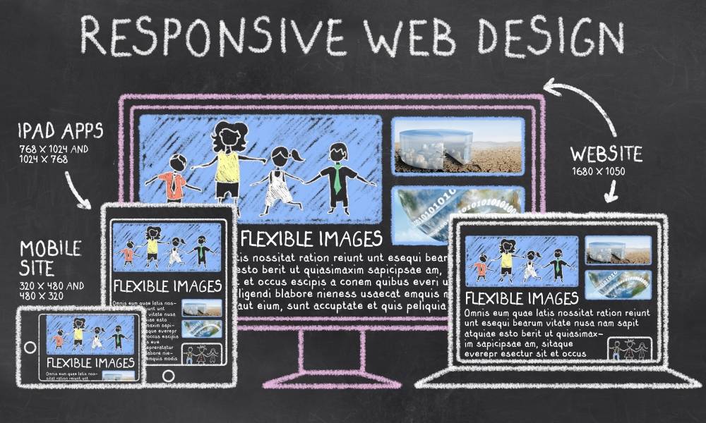
But did you ever think that people may have problems trying to read those tiny fonts that show up when the mobile version of your site is loaded in their phones' browsers? Sure, if your audience consists of teenagers in their 20s, this will not be a problem.
However, if you are selling reading glasses to people in their 50s, you'd better make sure that the size of the fonts that are used for the mobile version of your site is big enough.
2. Links that open new browser tabs.
Some designers prefer to open external links in new tabs. They think that this way, they'll keep the users longer on their sites. However, very few people notice that a new tab has popped up, especially because the new tab belongs to the same browser, so it inherits its properties and size.
This means that the website visitors don't have the option of returning to your website, because the newly opened browser tab doesn't have an active "back" button. The conclusion is really simple: always open new links in the current browser window, even if they lead to external sites.
3. Duplicate page titles, broken links, and more.
Search engines love unique content. It helps their users have a great experience, and thus return and use their services over and over. And this makes advertisers happy as well!
That is why you should strive to offer search engines as much unique content as possible. And when you're writing a lot of content, it's easy to accidentally create duplicate, or very similar page titles. Use a tool like this to audit your site and discover all its potential problems.
4. Using free images.
There are tons of great-looking, 100% free images on the web. But the main problem is that most web designers use them!
So, to stand out, spend some money and purchase high-quality stock images for your website. If it is possible, strive to create unique visual elements: images, graphs, videos, diagrams.
5. Hidden contact information.
I know that you've placed that information on the "contact" page, but you should make it available to anyone who may need it, regardless of the current webpage that they are currently visiting. So, make sure to include basic contact information in the website header and/or footer, for example.
6. Using Adobe Flash.
It's outdated, it poses high security risks, and it's going to die a horrible death in a few years. And with the very flexible HTML5 markup language at our disposal, it would be really stupid to go that route. Apparently, browsers will soon start notifying people that they're trying to access risky, Flash-based websites.
7. Huge loading times.
Let's be frank about it: a poor hosting account is the key factor that leads to huge loading times. You could, and you should always move to a faster host. But then, it's time to start optimizing your website as well.
Begin by trimming the code. Optimize those images, making sure that they continue to look very good (even though not perfect) and have a decent size. Include all those functions into a single JavaScript file, rather than forcing the browser to pause and load a dozen of tiny files.
Okay, I understand that you may not be an advanced web designer. I'm not one either! Fortunately, websites like this will help you determine all the problems, and offer you actionable advice as well.
8. Complex forms.
Yes, you'd like to get all the leads' info right away, including the size of their shoes, and so on. But people can easily get frustrated when you make them fill in long, complex forms, which require a lot of data.
Therefore, keep your forms as simple as possible. If it's a contact form, you'll only need to get people's names, email addresses and maybe their phone numbers. If it's a registration form, you should only get their names and email addresses. You'll (hopefully) get the rest of the data later on, when they become your clients.
These are some of the key web design mistakes that prevent people from having a great experience while they are visiting your website. The list isn't exhaustive, of course, but it highlights several important aspects that can be fixed quickly, and are guaranteed to improve the overall UX.